Page 1 of 1
New Junkkk from meee
Posted: Sun Aug 10, 2008 4:26 pm
by KantTouchThis
Posted: Sun Aug 10, 2008 4:37 pm
by Corvette19
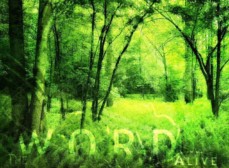
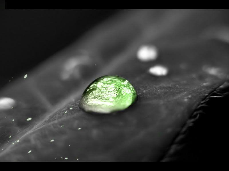
I like the forest one.
Posted: Sun Aug 10, 2008 5:00 pm
by ScottyGEE
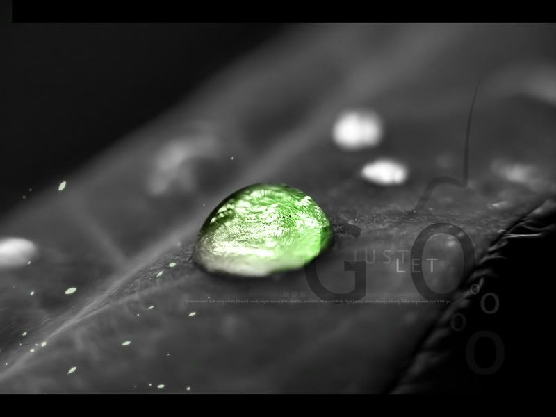
I dislike the text in each of them. However if it was without it, then I would go for the last one.
Posted: Sun Aug 10, 2008 5:21 pm
by Lambda
ScottyGEE wrote:I dislike the text in each of them. However if it was without it, then I would go for the last one.
[size=0]300th post[/size]
Posted: Sun Aug 10, 2008 5:59 pm
by KantTouchThis
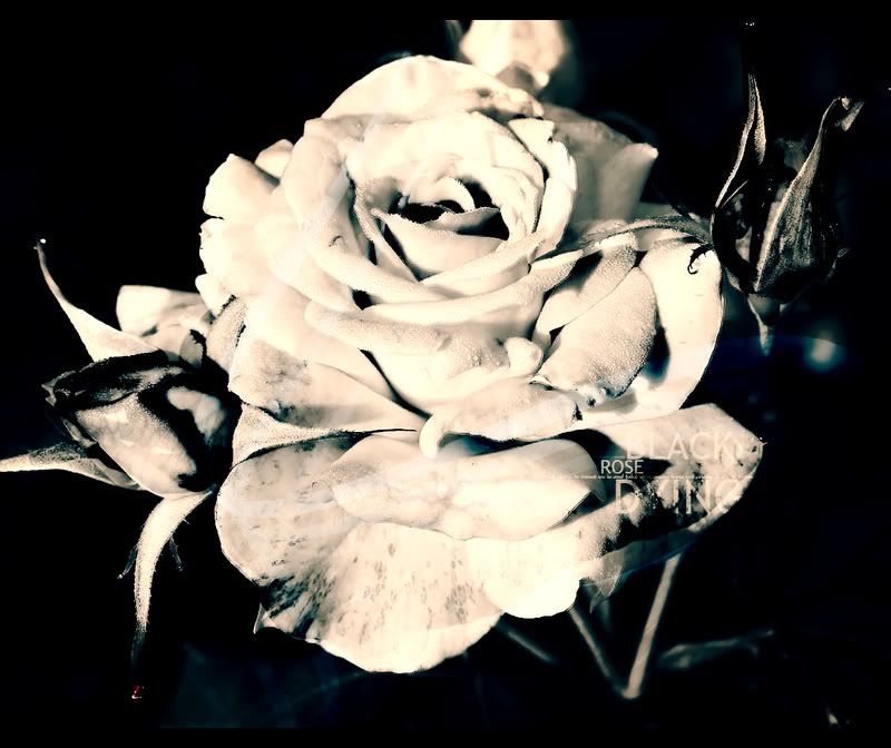
Really, I think it looks better with the text
Posted: Mon Aug 11, 2008 1:49 am
by JK-47
Last one is amazing.
Posted: Mon Aug 11, 2008 3:03 am
by ScottyGEE
Well the text definately makes it look better than without it by comparison. However, perhaps I just don't like what the actual text is

But I still do like the way it is...Perhaps its because green is the best colour and with the rest being grey it just makes it stand out so much more ("thats the point duh" yeah I know)
Posted: Sun Aug 24, 2008 3:48 am
by KantTouchThis
Posted: Sun Aug 24, 2008 7:32 am
by RaVNzCRoFT
They're all extremely good.