Page 1 of 1
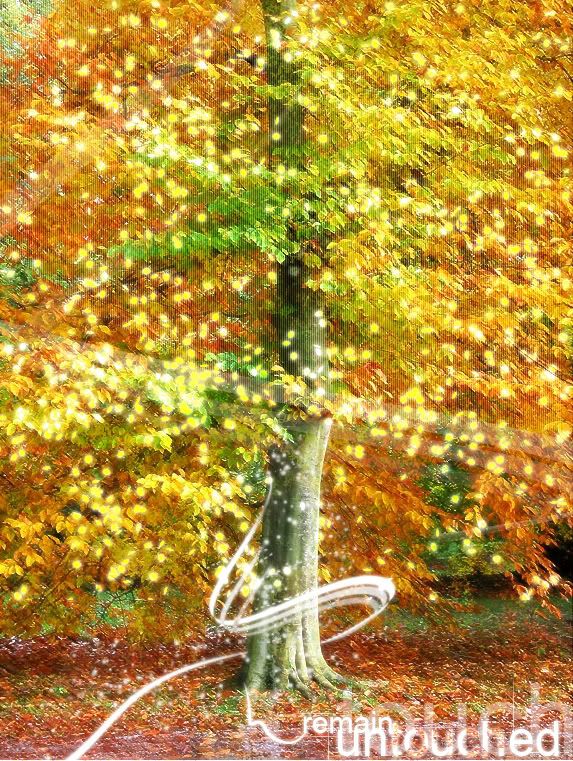
Well hey, its a tree..
Posted: Tue Jun 10, 2008 1:01 pm
by KantTouchThis

feels like i need to add something more..
comment please
Posted: Tue Jun 10, 2008 1:09 pm
by TomClancey
Looks nice, I like it.

Seems like it's a bit over saturated, but other then that, it's good.

Posted: Tue Jun 10, 2008 6:41 pm
by CloudStrife1100
well this is about the prettiest ive seen. i really like it
scan lines arent too apparant, colors are all well lit, sig has flow
as for somehting missing, its always a personal thing of mine to add a border. something of this size and mangnitude needs something soft around the edges.
rate:
||||||||||
-C.Paul
Posted: Tue Jun 10, 2008 7:41 pm
by JK-47
Not bad.
I'm not a fan of the scan lines, though.
Posted: Wed Jun 11, 2008 2:51 am
by KantTouchThis
yeah i dont really like the scan lines anymore either.. im gonna change it later.
Posted: Wed Jun 11, 2008 8:04 am
by SHOUTrvb
I think it'd look better without the massive abuse of olverlayers. I'm not really feeling all the Yellow Pixies either. It's a nice photo for the most, and your concept started well, but you sorta choked it towards the end. I like the swirls toward the bottom though.
Posted: Wed Jun 11, 2008 2:28 pm
by KantTouchThis
Idk what you mean with "massive abuse of olverlayers."
Posted: Wed Jun 11, 2008 3:16 pm
by Dr.Cox
Filters on top of filters on top of more filters, basically.
And to many layers overlayed?
IDK.
Posted: Fri Jun 13, 2008 8:25 pm
by RaVNzCRoFT
Cool to see you back, KTT.
Posted: Fri Jun 13, 2008 8:26 pm
by kibito87
This looks cool. I like it. Personally, i'd do without the scanlines as specified previously.
Posted: Tue Jun 17, 2008 12:53 pm
by KantTouchThis

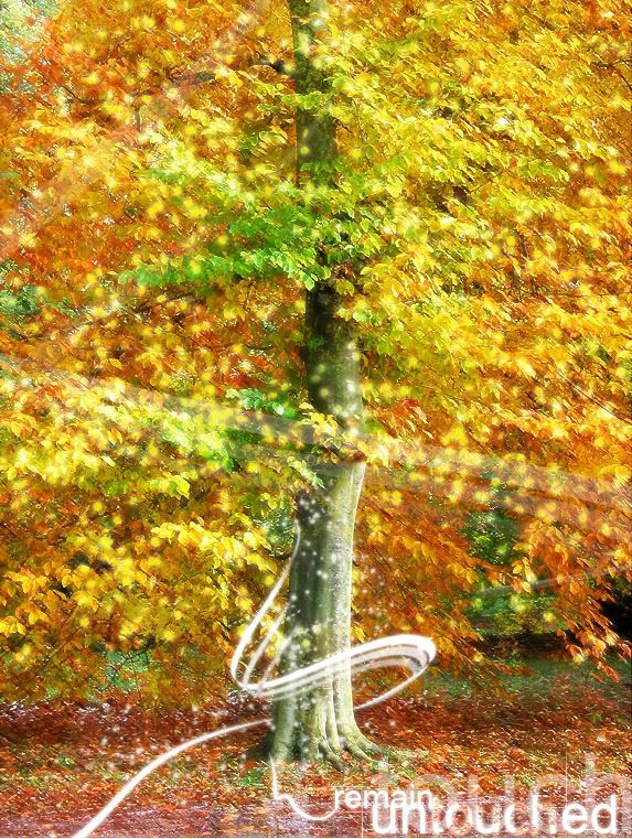
V2
Posted: Tue Jun 17, 2008 1:30 pm
by DRL333
I'm not too fond of the orange spots in the text, but other than that it's beautifle.
Posted: Fri Jul 04, 2008 8:11 pm
by beastiekid21
v2 is alot better but your title "remain untouched" is hypocritical since the tree has many effects on it. the swirl and the line is nice but the yellow highlights are too overpowering try lowering the opacity and i think it would look alot better maybe do some burning dodging or blurring to add some more depth in the tree itself. good job overall though haha.
Posted: Sat Jul 05, 2008 7:12 am
by bcnipod
I don't like the way the "touch" in the word "untouched" looks.
Posted: Sat Jul 05, 2008 11:18 am
by Cuda
thing that I would change would be the spots. Reduce the count, and spread them out a bit. The highlights are a bit overpowering.
Posted: Sun Jul 06, 2008 9:17 pm
by Dagger13
i really like it but i dont like the "touched" text and above that you can see grass that looks like you just took a picture from you backyard(i dont like that)
