Page 1 of 1
figgy font *medium size file*
Posted: Wed May 14, 2008 7:27 am
by propagandaman
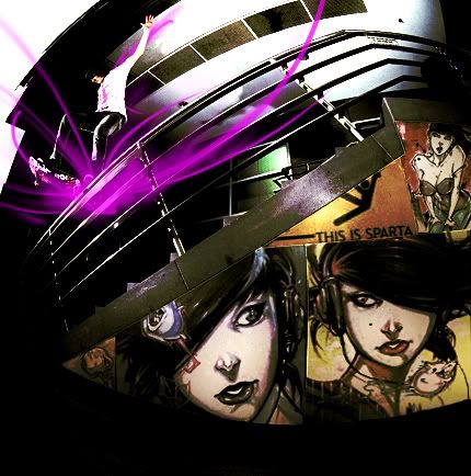
critique please, i have original too if anyone wants to see
Posted: Wed May 14, 2008 7:39 am
by propagandaman
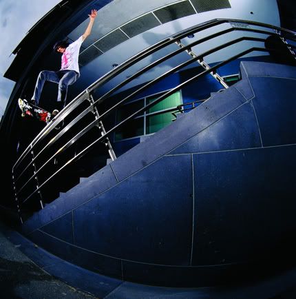
k, heres the original, so you can see what i did
Posted: Wed May 14, 2008 8:13 am
by {TP}Spartan
lawl@spartankick 8/10 for the graffiti style of it but I think the glow under the board killed it.
Posted: Wed May 14, 2008 8:22 am
by propagandaman
i was using that for a center of focus. thanks though
anyone else?
Posted: Wed May 14, 2008 8:28 am
by propagandaman
that better?
Posted: Thu May 15, 2008 8:16 pm
by JK-47
I like it.
Posted: Sat May 17, 2008 9:00 pm
by Dsoup
I like the graffiti but not much a fan for anything else.
Posted: Sat May 17, 2008 11:43 pm
by Danke
Dsoup wrote:I like the graffiti but not much a fan for anything else.
Agreed. Magenta just feels like the OMG wrong color, and the blurryness of it doesn't seem to fit the super sharpness of the rest.
Posted: Sat May 17, 2008 11:57 pm
by Senor_Grunt
Its not so much too sharp, just way to over-contrasted. I say keep the thing under his board, but make it a different color, cause it feels empty with out it.
Posted: Thu May 22, 2008 1:55 pm
by propagandaman
k, anyone got a color that i should use instead of the magenta?
Posted: Thu May 22, 2008 2:22 pm
by {TP}Spartan
propagandaman wrote:k, anyone got a color that i should use instead of the magenta?
Lime Green,Blue,or a color that blends with the background.
Posted: Sat May 24, 2008 6:16 pm
by propagandaman
k, the magenta is from the logo on the guys shirt, i enjoy subtle refrences and was hoping someone would notice. ill change it and post by monday
Posted: Sat May 24, 2008 8:24 pm
by Dr.Cox
Over-Contrasted.
I think that the look for the graffiti is fine... But I think you need to make the skater and the rail Clean and Pristine looking.