Page 1 of 1
3 simple sigs I made of a render.
Posted: Mon May 07, 2007 6:27 pm
by SHOUTrvb
The render isn't like fancy or anything, I made it for some webdesign, so it wasn't meant to be incredible. Still, I like how it turned out:
Render Edit: You may not for
any reason use it without asking.(very hi def):
http://shoutrvb.latest-design.com/abstr ... 1080p2.png
Sig 1:

Sig 2:

Sig 3:

Posted: Mon May 07, 2007 6:57 pm
by noscottno
Neato. I like the first on the best, it reminds me of Eddie Van Halens's guitar.
Posted: Mon May 07, 2007 7:26 pm
by JK-47
That's way awesome, it would look really good as a darker blue IMO.
Posted: Mon May 07, 2007 8:38 pm
by bronchidus
i like it, kinda reminds me of mine, no offence ;p
Posted: Tue May 08, 2007 1:38 pm
by SHOUTrvb
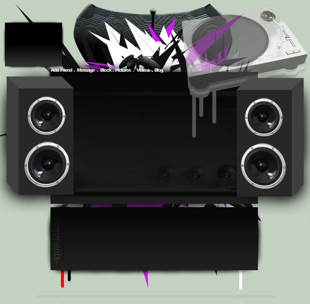
Thanks, keep them coming. I just finished the layout I was making for a friend:
http://img.photobucket.com/albums/v121/ ... filebg.jpg
Posted: Tue May 08, 2007 2:04 pm
by Darco
At the end of where the color is "dripping" or running off, shouldn't it be a little less opaque? Or is it more opaque?
That, and the slight blur at the top of each speaker. The rest is great.
Posted: Tue May 08, 2007 7:55 pm
by bronchidus
that looks like one heck of a profile to code, good luck!
Posted: Wed May 09, 2007 6:39 am
by SHOUTrvb
bronchidus wrote:that looks like one heck of a profile to code, good luck!
You've no idea.

I just finished it, and I still can't get it to work well with resolutions higher than 1024 x 768.
Posted: Wed May 09, 2007 7:25 pm
by bronchidus
yea, are just puttin everthing on the pivture? or usin multiple layers because that might be easier...
Posted: Wed May 09, 2007 7:44 pm
by SHOUTrvb
I used css to lay them over the picture. If you have any idea to do something better, I welcome help with very open arms...and eCookies....
Posted: Wed May 09, 2007 8:17 pm
by bronchidus
well what you could do, if the person your makin it for, doenst want to change the info often only the picture then have all the info in the speaker part and type in and use that as a layer. then put the turntable over that.
And the part with massage me and stuff just make it its own layer on the css use arial and put letter spacing to less so it looks kinda crunched. Then put the part with render behind it all using a separate layer or class in the css
Then have the tanish color below everything else on its own layer below everything else
Then put the picture of him/ her on a top layer and after that just place everything. You can use decimals i think hahaha. btw i have little knowledge but my profile is in layers and stuff like multiple tables and stuff it makes things easy to place because im a begginer and that how the tutorial i followed long ago told me haha
Posted: Wed May 09, 2007 8:26 pm
by XBC-Requiem
I think that the one you're using is the best one there.
Posted: Thu May 10, 2007 6:45 am
by SHOUTrvb
Thanks, and I'll see what I can do. Thanks to you as well Requiem.