my newest/first sig.
Posted: Fri Jun 23, 2006 10:00 pm
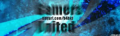
i read around a bit in here, and learned a ton about photoshop from the pro tag tutorial. here's my working sig in nearly final form (might add some text later).
(with a link, of course)

i used 3dsmax to create and render some abstracts (found a short tutorial through google) used in the sig. made the "zandi" in the bottom-right corner by hand with the pencil tool (woot) and grabbed a skull picture off a news site. all-in all, took me about 2-3 hours. and of course, fell free to check out the forums it leads to. that's the main reason i made it, anyways.
now that i look back, i'm not too fond of using the skull twice, and i'll probably change that, but i really like how i used the abstracts, especially the color dodge (i believe) one. it's too bad, but i used some cool gradients in there, the one where it's multiple bars. can't see it though...
(with a link, of course)
i used 3dsmax to create and render some abstracts (found a short tutorial through google) used in the sig. made the "zandi" in the bottom-right corner by hand with the pencil tool (woot) and grabbed a skull picture off a news site. all-in all, took me about 2-3 hours. and of course, fell free to check out the forums it leads to. that's the main reason i made it, anyways.
now that i look back, i'm not too fond of using the skull twice, and i'll probably change that, but i really like how i used the abstracts, especially the color dodge (i believe) one. it's too bad, but i used some cool gradients in there, the one where it's multiple bars. can't see it though...