Page 1 of 1
Two new sigs
Posted: Fri Dec 23, 2005 8:40 pm
by Spartan Sniper
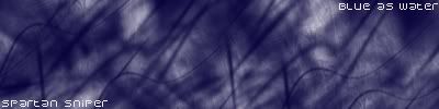
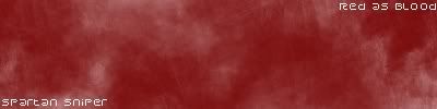
RnC
Posted: Fri Dec 23, 2005 11:20 pm
by JK-47
meh, i dont really like them, too plain

Posted: Sat Dec 24, 2005 12:37 am
by Cuda
its just over brushed. theres no depth. No border, and text is too plain.
Posted: Sat Dec 24, 2005 12:48 am
by maca_§
They need to be doing something, there is nothing happening there.
I like your current though.
Posted: Sat Dec 24, 2005 5:57 am
by Spartan Sniper
thx
well i was testing out somethings in gimp and i wanted to get some opinions on it
Posted: Sat Dec 24, 2005 7:24 am
by RaVNzCRoFT
No depth.

Posted: Sat Dec 24, 2005 3:33 pm
by lxNicktardxl
multi-genre wrote:meh, i dont really like them, too plain
Posted: Sun Dec 25, 2005 6:28 am
by Patrickssj6
lxNicktardxl wrote:multi-genre wrote:meh, i dont really like them, too plain
Posted: Sun Dec 25, 2005 8:21 am
by wes
RaVNzCRoFT wrote:No depth.