Page 1 of 1
My new NON BLUE sig.
Posted: Sun Oct 09, 2005 10:29 pm
by Spitfire
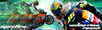
Plz post comments. If you know MotoGP you'd know whats wrong with it

Posted: Mon Oct 10, 2005 10:56 am
by Phosphorous
A border would be nice, doesnt have to be complicated. A simple 1-pixel border would do.
The text could also use some blending.
Cool blur effects.
Posted: Mon Oct 10, 2005 11:44 am
by srgt. maddog
Yeah the guy is standing on his motorcycle LMAO.
Posted: Mon Oct 10, 2005 1:34 pm
by Spitfire
I dont know how to do borders and i Dont know how to blend text. Im still working on it.
Posted: Mon Oct 10, 2005 1:36 pm
by RaVNzCRoFT
WTF do you mean you don't know how to do borders!!?? Sure there's an easy way to make them with stroke, but you could AT LEAST use the pencil tool and go around the sig in black!!!!!!!!!!!!!!!!!!!!!!!!!!!!!
Posted: Mon Oct 10, 2005 2:38 pm
by Spitfire
RaVNzCRoFT wrote:WTF do you mean you don't know how to do borders!!??
I dont know how to make boreders... I want to put some metalic one on tho
Posted: Mon Oct 10, 2005 4:36 pm
by wes
Steps to making a simple 1 pix border:
Create a new layer above the rest
press ctrl+a (the whole canvas should be selected)
Edit -> Stroke
1 pix, whatever color, inside
done