Page 1 of 2
New Signature and New Avatar
Posted: Thu Aug 25, 2005 5:28 pm
by MoDxNOVA
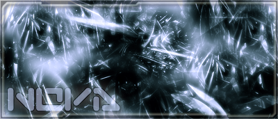
Signature:
Its my first attempt at using brushes, and I'm hoping it looks OK. Rate it if you want x/10. thanks.
Avatar:
Its the same one as before, just touched up a little bit. Rate it just like the Signature
Posted: Thu Aug 25, 2005 5:29 pm
by wes
well, ur signature is oversized

i like the brushing, but its missing something... color mb?
Posted: Thu Aug 25, 2005 5:51 pm
by Waverunner
Maximum size is 400x200.
Posted: Thu Aug 25, 2005 6:12 pm
by maca_§
Nice.
The text kinda ruins it but everything else is cool.
Posted: Fri Aug 26, 2005 3:09 am
by MoDxNOVA
Any reccomendations on the text, or what to do with it?
Posted: Fri Aug 26, 2005 3:14 am
by maca_§
Don't bevel it

.
Try whatever you can before you go to bevel is what I do, hehe.
Posted: Fri Aug 26, 2005 6:49 am
by NOVA
NEW ACCOUNT!!!!! that "MoDx" stuff was gay lol. i'll try out that un - beveling now.
My First attempt, any comments?
Posted: Fri Aug 26, 2005 7:00 am
by Patrickssj6
you just could have your name changed.Just ask wave
Posted: Fri Aug 26, 2005 7:07 am
by NOVA
that would have made things easier. lol
My New attempt. my first sig with a popout
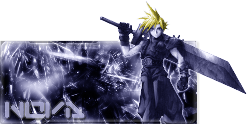
My Second Sig with a popout
Posted: Fri Aug 26, 2005 12:29 pm
by Patrickssj6
I like it its aweosome
Posted: Fri Aug 26, 2005 1:08 pm
by NOVA
Thanks, not too bad for only having photoshop for 5 days lol
Posted: Fri Aug 26, 2005 5:03 pm
by maca_§
Yaay no bevel on the text! Hehe.
Anywho it looks great! Well done.
Posted: Fri Aug 26, 2005 5:12 pm
by NOVA
Thanks maca, it looks way sweeter without the bevel. i learned alot today, and I also got a few new brush sets so I can start doing signatures for other ppl.
Posted: Fri Aug 26, 2005 5:15 pm
by maca_§
Also, if you want more brushes, check out
deviantART.
It's got a sh*t load of 'em there.
Posted: Fri Aug 26, 2005 8:07 pm
by The_Hushed_Casket
I like how the yellow hair is the only color. Those are all sweet, although in the second pop-out it looks wierd where the render cut's off outside of the signature. Those are great for firsts.
Posted: Sat Aug 27, 2005 2:04 am
by NOVA
yeah, i know what i did wrong on the second one, easy fix lol i was just lazy at the time.
Posted: Sat Aug 27, 2005 8:35 am
by JK-47
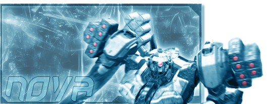
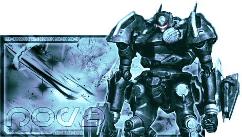
i really like the one w/ the robot
Posted: Sun Aug 28, 2005 4:24 pm
by NOVA
Heres another one with a robot,
and heres one with animation, the animations not that good, but the signature itself is hilarious btw, my name is nathan, and i did this for the forums on
www.teamhotpeople.com, which coincadentally are pink

Posted: Sun Aug 28, 2005 5:43 pm
by Captain Cornflake
[quote="maca_
Posted: Sun Aug 28, 2005 5:59 pm
by BEEF!!!
10/10 On the last 3. Those are amazing man!
EDIT: Except the heart one =P