Page 1 of 1
two new sigs
Posted: Wed Jul 27, 2005 7:42 am
by Aron
What do u tink!
please give me some pointers or help espcially for the text
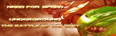
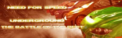
1.
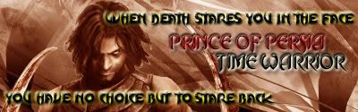
2.
Posted: Wed Jul 27, 2005 7:58 am
by twister21
gah that's really hard to choose since they're both awesome games, but i had to go with Need For Speed, since in reality that's closer to home for me. the only thing i might change is the color or outline of the text, since it is a little hard to read, other than that it looks great. nice job.
Posted: Wed Jul 27, 2005 1:09 pm
by Aron
thanks
keep them cumming people
Posted: Wed Jul 27, 2005 8:39 pm
by maca_§
Did you make the backgrounds? Just wondering.
Anyway, try not to use Bevel and Emboss so many times on texts.
Really looks bad. Plus it makes it a bit hard to read clearly at times to.
Like the NFSU2 Sig.
But other than that they're alright

.
Posted: Thu Jul 28, 2005 1:32 am
by Aron
thanks i agree
Posted: Thu Jul 28, 2005 1:44 am
by Aron
what u tink now!
Posted: Thu Jul 28, 2005 3:21 am
by shadow wolf
One word. Border.
Give them a pixel border and i'll give them 6/10.
Posted: Thu Jul 28, 2005 3:43 am
by maca_§
Aron wrote:
what u tink now!
Easier to read, but still to much Bevel in my opinion.
But like Wolfy said, put a border on 'em.
Posted: Thu Jul 28, 2005 6:04 am
by Aron
k ill do it as soon as