Page 1 of 1
my newer skins
Posted: Sun Jan 27, 2008 2:18 pm
by chocolate10
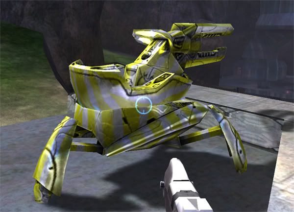
well last time was horrible i am sorry for that but these i think are a little better
Posted: Sun Jan 27, 2008 2:40 pm
by kyearby91
you should go for a more realistic look next time.
Posted: Sun Jan 27, 2008 4:27 pm
by halomacmodder
Disgusting! Eww.... *Barfs* *Chokes* Need air! Help! It looks like a 2 year old on crack finger painted all over those. -∞/10
Posted: Sun Jan 27, 2008 4:58 pm
by JK-47
Looks like candy.
Never paint solid colors over detailed bitmaps unless the solid colors have detail within itself. Otherwise it looks bad.
4/10
Posted: Sun Jan 27, 2008 7:09 pm
by shortbusheros4
this is my attempt at making it more detailed
Posted: Sun Jan 27, 2008 10:14 pm
by Pepsi
bus, dont hijack like you did the peli thread. Fair warning from a friend.
Posted: Mon Jan 28, 2008 7:17 am
by Yodel
Again, use more thought! The jarring bright colors make it stick out like a sore thumb!
Posted: Tue Jan 29, 2008 3:42 pm
by Jsk1610
Try not to change the whole bitmap. Do slight edits to it to make it recognizable. Keep it under control. Plus, I'm not diggin' the stripes so much. Keep up the work though. (and yes, shadowkhas, I'm back after a year I got bored much?)